United Healthcare
Provider Search Experience (Web)

As Design Lead, I led a team of UX designers and researchers to redesign the United Healthcare provider search experience. Partnering closely with product and business teams, I shaped the strategic vision and product direction while providing hands-on guidance to build a scalable design system. Our work streamlined the design process, improved efficiency, and enhanced the user efficiency by 40% for nearly 62 million users.
Problem Space
The provider search platform was facing significant challenges that hinder user satisfaction and engagement:
1. Users are not finding the results they’re looking for: Despite using the search functionality, users often struggle to locate relevant providers, leading to frustration and a poor user experience.
2. Complex data mapping and cluttered information display: The platform contains a substantial amount of legacy and complex information. This results in intricate data mapping and a cluttered information display, making it difficult for users to navigate and find the necessary details efficiently.
3. Low follow-through rates: Users are not proceeding to visit the healthcare providers they have searched for. This indicates a significant drop-off in the user journey, suggesting that the search results or the information presented may not be compelling or trustworthy enough to encourage follow-through actions.
4. Lack of trust in the company’s data search experience: Users exhibit a lack of trust in the search experience provided by our platform. This distrust may stem from perceived inaccuracies, outdated information, or a poor user interface, further exacerbating the issues mentioned above.
The Challenge
The previous search experience presented several key design challenges, particularly in how data was mapped and displayed across typeahead suggestions and search result pages. Inconsistent and unconsolidated data mapping led to irrelevant search suggestions and disorganized results, which created confusion and frustration for users. The journey to reach a provider's detail page required five or more clicks, often surfacing non-actionable or unclear information along the way. Additionally, the use of ambiguous icons further contributed to user uncertainty. These issues not only eroded trust in the data but also led to increased fall-off rates during the search experience.
We conducted user research to understand the pain-points in the current search journey.
User Research Findings
1. Users find results unrelated to their search and confusing
2. Users didn’t trust our data
3. Users don’t understand iconography used on site and find them distracting

Design Thinking Workshops
Based on the research insights, I used the "Good, Better, Best" approach to collaborate with data scientists and define the realistic boundaries of data mapping. With current data challenges and user feedback in mind, the design team explored solutions ranging from quick wins to ideal-state experiences, ensuring our designs effectively addressed user pain points while remaining feasible to implement.

-
Keep current data mapping
-
List repeated suggestions in order
-
Use tags to indicate the category group (business requirement)

-
Eliminate repeated suggestions
-
AI-driven ranking on related search
-
Tags to indicate the category group (business requirement)

-
Eliminate repeated suggestions
-
AI-driven ranking on related search
-
Remove category tags based on user feedback
To foster alignment and deepen stakeholder engagement, I led a series of collaborative workshops using the “Good, Better, and Best” framework. This approach helped to set clear expectations while encouraging constructive dialogue. By introducing low-fidelity mockups early in discussions, I enabled stakeholders to make business decisions with design in mind. Critical user feedbacks were also shared to close the gap of siloed decisions, and allow the voice of customers heard. User insights revealed a clear business need to rebuild user trust through a simplified and familiar search experience, one that aligns with conventional search models.
Design Iteration


Design Management
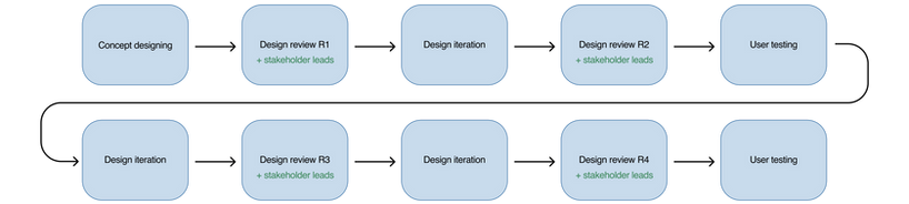
To build trust with business stakeholders and align on strategic direction, I led a collaborative design process that encouraged early feedback and cross-functional input. By sharing design mockups and identifying opportunity gaps early, we streamlined iterations, uncovered key research areas, and reimagined a provider search experience that was simple, relevant, and trustworthy.
Through ongoing stakeholder alignment and close collaboration with cross-functional teams, I led the redesign of the provider search experience, ultimately reducing the number of clicks from six to three, a 40% improvement in user efficiency. By partnering with data scientists, I drove the consolidation of fragmented data mapping, enabling a more intuitive and conventional search experience tailored to users’ expectations within the healthcare domain.

Outcome
The new provider search experience is live for both web and app and includes:
1. 🔍 Member-specific search: Allows members to find care tailored to individual family members' needs.
2. 🧑💻 Claims-aware search: Utilizes AI and ML to highlight the most relevant providers based on previous services received.
3. 👨+👱 Side-by-side provider comparison: Enables members to compare providers based on their preferences, helping them make informed decisions.
4. 💵 Integrated cost estimates: Offers financial transparency by providing cost estimates for services from various healthcare professionals.
5. 🏅 Best Match search logic: Prioritizes high-value and cost-efficient providers to optimize healthcare spending.
6. 📍 Map view: Enhances the search experience with an interactive map to locate providers easily.
.jpeg)
.jpg)

