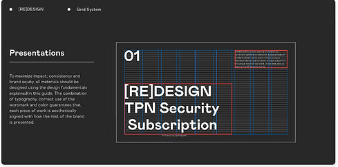
Design System
Asset Library in Figma
The design process becomes significantly more effective when supported by a robust asset management system. To streamline and unify the visual language across multiple service platforms, I developed a comprehensive design system library in Figma. This library not only ensured consistency and efficiency across projects but also fostered collaboration by providing a centralized resource for scalable design assets and components.


Overview
While working at a startup on its first SaaS application, I was thrilled to create design patterns and user flows at scale. However, during the preparation of a prototype for user testing, I noticed a recurring inefficiency: I was spending countless hours duplicating the same patterns across multiple screens. This repetitive work not only consumed valuable time but also added unnecessary costs for the company.
I took the initiative to refine my skills by enrolling in a course and immersing myself in creating more efficient, scalable design systems. This experience shaped my approach to design, fostering habits that maximize efficiency while maintaining quality—ultimately contributing to the company’s goals more effectively.
Challenges
Lack of asset management results is causing inefficiently resulting long work hours and recurring inefficiency.
How might we work smarter?
Problem Space
-
Work Efficiency
There were wasted hours were going into recreating repeated design elements and interactive states. -
Design Consistency
Similar design elements were being created with variations across multiple platform designs under ONE brand umbrella.
Approach
I reviewed and re-evaluated the program the team is currently using. Then, extracted out what we can utilize that is already being offered.
-
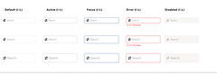
Components
2. Team Library
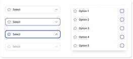
3. Interactive Components
Components consist of repeated design elements. Components help your design be consistent and allow you to quickly apply changes.
Share your created components and styles across the team to stay streamlined in the visual language used in multiple projects.
Save time when creating prototypes by creating interactive components.
Project Goal
-
Create components and team library to streamline design elements
-
Create interactive component to enhance prototype interactions
Atomic Design Methodology
In the natural world, atomic elements combine to form molecules. These molecules can combine further to form relatively complex organisms. Let’s apply that to create a design system.
Atoms
Atoms are the basic building blocks of all matter. They can’t be broken down further without losing their meaning such as colors, typography, grids, etc.


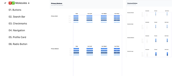
Molecules
Molecules are groups of two or more atoms held together. These combinations of atoms take on their own unique properties, and become more tangible and operational such as buttons, search bar, checkmarks, etc.
.jpg)
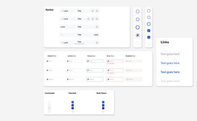
Organisms
Organisms are assemblies of molecules functioning together as a unit such as inputs, dropdowns, filters, etc.

.jpg)
Interactive Components
Interactive components are crucial feature to eliminate time wasted when creating prototypes.
Once all states of a components are created, you can link interactions to turn them into an interactive component. See how they work by interacting with elements below.
.jpg)
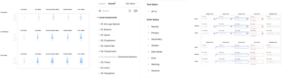
Design System Library
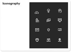
Icon Library

Utilizing Tokens
I utilize design tokens that can be referenced across design and engineer teams. I set the foundation by setting primitive tokens to raw values, then semantic tokens to translate the core style properties to more specific scenarios.

End Result
1. Reduced project timeline by 30%
The team was creating mockups and prototype 30% faster, with 80% less errors with the new interactive components.
2. Improved Design Handover
Improved prototype interactions resulted in less dev team call hours, which allowed team to shift next priority in-line faster.